The iPhone was introduced in 2007, and at that time, the shutter button on the camera app was the only way to take a photo. In 2011, with iOS 5, Apple made the volume buttons on the sides of the iPhone act as the shutter button. Last year, with the iPhone 15 Pro and Pro Max, we got a new button – the action button – which could be customised to do anything you wanted, including acting as the shutter button if you set it up to open the camera.
This year, we have a new “Control” that allows us to open the camera and also take photos. Apple doesn’t want to call this a button, but that’s essentially what it is, and people will inevitably end up calling it a button anyway. I’m going to call it a button too.
I’ve had the iPhone 16 Pro Max since launch day, and the Camera Control was the feature I was most excited about. I set up my phone and tried using it for a few minutes, only to realise it was more complicated than I had expected. There’s a press, a double press, a click, swipe gestures; this “button” – sorry, “control” – has a lot going on for something that’s barely 2 centimetres long.
The Position of the Control
Before you buy or try out any product or feature, you build up a lot of expectations in your mind. For me, it was using the Camera Control as a shutter button. I own a Fuji XT-3, and the shutter button is exactly where you’d expect it to be-ergonomically. You pick up the camera, and the button naturally falls where you’d expect to click and take a photo.
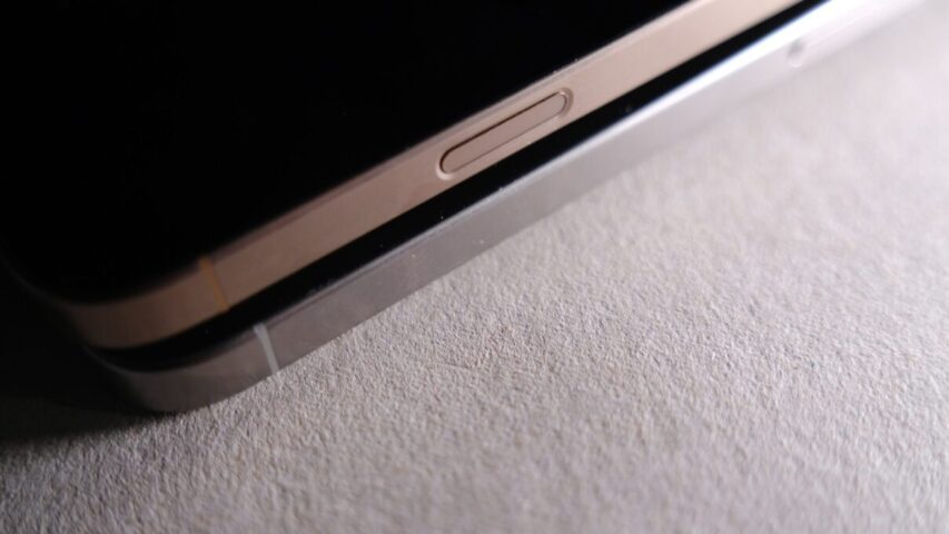
However, the Camera Control on the iPhone isn’t in the ideal position for me, at least. After holding the iPhone in a certain way for over a decade. When I pick my phone up and hold it by the sides, I expect my right index finger to land exactly where the Camera Control is, but it doesn’t. Instead, I have to hold my phone slightly differently, covering the bottom right of the iPhone screen for the Camera Control to feel ideally placed. When you use the Camera Control, the UI elements on the camera app disappear, which I think might be intentional to reduce the chance of unintended inputs. (This can be turned off, but by default, the UI disappears, giving you a clean interface to navigate via the Camera Control.)
When I hold the phone vertically, however, the Camera Control is in the ideal spot! It still takes a bit of getting used to, especially when I have to click to take a photo, but the placement of the control is perfect—it’s exactly where my thumb would naturally rest.
I think the location of this control is a compromise between landscape and portrait orientations. Also, Visual Intelligence, when it arrives, seems to be primarily used when holding the phone vertically, and this could have influenced where the Camera Control was positioned on the side of the phone.
In the past two weeks of using the new iPhone, I’ve adapted to holding it in a way that lets me use the Camera Control more comfortably. Although it’s not ideal yet, I’ve learned to make it work. Ask me again in a few months or years, and I might even say it is in the ideal spot. New tools often require new ways of working, and I think it’s just a matter of retraining myself on how to use it.
Using the Camera Control
Yours truly, writing about the action button about 6 months ago:
The rumour mill is stating that the iPhone 16 line of iPhones will have a dedicated “capture” button and I hope the placement of the button would mean I can get to the camera fast and also use it as a physical shutter button.
I’m glad we have the Camera Control, but I don’t think it’s the fastest way to access the camera. The Camera Control only takes you to the camera app when the phone’s display is active. So, when your phone is in your pocket and you want to take it out and be ready to shoot, clicking the Camera Control doesn’t help. You have to ensure the display is lit up, and then click the Camera Control button. This is why I still think the action button is the fastest way to access the camera.
However, there is an accessibility setting you can change to access the camera via the Camera Control even when the display is off-by enabling the double-click option instead of the single-click option.
This means you have to double-click the Camera Control button to enter the camera, even when the display is active. It’s a workaround, but I do hope Apple will change this in a future software update, allowing a single click to take you straight to the camera. Apple may have avoided this to prevent accidental clicks, but I’ve never had an issue with unintentional presses on the Camera Control. I still have the action button set to the camera, mostly out of muscle memory, but I’d like to free up the action button for something else if and when the Camera Control lets me access the camera more quickly.
The Camera Control does a lot-it’s a single button that essentially lets you handle everything you need to take the kind of photo you want. Take a “real” camera, for example—the shutter speed and exposure controls aren’t all linked to the same button, toggle, switch, or dial. Even in the iPhone camera app, everything is a visual element on screen, but not everything is in one location or hidden behind a single UI element.
The Camera Control tries to manage everything with one button. A press brings up the adjustment dial for the specific setting you want to change. For example, if you’re on the exposure dial, you can turn the exposure up or down. A double press gives you access to all the menus—exposure, zoom, focal lengths, camera lenses, styles, etc. You swipe on the button to move between the items in the menu, and then press again to enter a specific menu and make your adjustments.
Every input you need before taking a photo is done through presses and swipes, all of which provide great haptic feedback as you navigate the menus. Once you’ve made all your adjustments, you click to take the photo. By “click,” I mean an actual physical press, like a traditional button. This feels odd because this button you just clicked doesn’t look like the other four buttons on the iPhone-it’s recessed, stays flush with the sides of the phone, and your brain has to pause and think before pressing it.
iOS 18 is the most customisable version of iOS that Apple has released so far, yet Camera Control feels more restrictive, despite its capabilities. I’d like to see further customisation options in the Camera Control settings—such as the ability to disable features I never want to use with the Camera Control, like zoom. I’ve always maintained that taking a photo with the .5, 1x, 2x, and 5x lenses and then cropping the image later yields much better results than using digital zoom. So, while switching between the camera lenses using Camera Control is great, zooming is not. But of course, preferences vary, and this is why customisation is important.
The most annoying issue with the Camera Control is actually related to Photographic Styles. This seems to be a bug that Apple’s QA team missed, though no one appears to be reporting on it. Since the iPhone 14 Pro, I’ve been shooting in RAW, and I intend to keep doing so. In the Camera app, when you enable RAW, the Photographic Styles option disappears, meaning you can’t apply styles to RAW images. However, in the Camera Control menus, the style and tone options don’t disappear when RAW is selected.
So, you can use the Camera Control to change styles and tones to your heart’s content, take a photo, only to find that none of the styles or tone adjustments have been applied (because you were shooting in RAW). I hope this gets fixed soon, as it’s not the experience one would expect from Apple.
Closing thoughts
Reading all the above, you might think I don’t like what Apple has given us, but in fact, it’s the opposite. When I first unboxed my phone, I played around with the Camera Control and didn’t love it straight away. However, in the last two weeks of using my phone, I’ve become more appreciative of it.
I’ve always pressed the shutter button in the middle of the Camera app UI to take photos, ever since I started using iPhones. I’ve rarely used the volume or action buttons for taking photos. But I’ve used the Camera Control shutter a lot, and I know I’ll continue using it. Having used iPhones since 2011, there’s a lot of muscle memory associated with tapping the white circular capture button on the camera app, but I can see the Camera Control button taking over-not all the time, but there’s definitely more satisfaction in using it. This might be because it’s new and novel; it’s too early to say for sure, but for now, I’m enjoying it.
In its current state, the Camera Control feels very much like a 1.0 feature. There’s a lot of room for improvement. If you’re not completely in love with the Camera Control, there’s no harm done
-it doesn’t take away from the greatness of the new iPhones. You can simply disable it in settings, and the iPhone 16 Pro Max is still an excellent phone.
What I’d love Apple to do is provide more customisation options for the Camera Control via software updates. Apple should invest in this button with more software features; otherwise, I fear it might go the way of the Touch Bar in MacBook Pros. Surprisingly, they’ve allowed third-party apps to access the Camera Control, but I hope Apple themselves give us more first-party customisation options to fine-tune the button to suit our preferences.