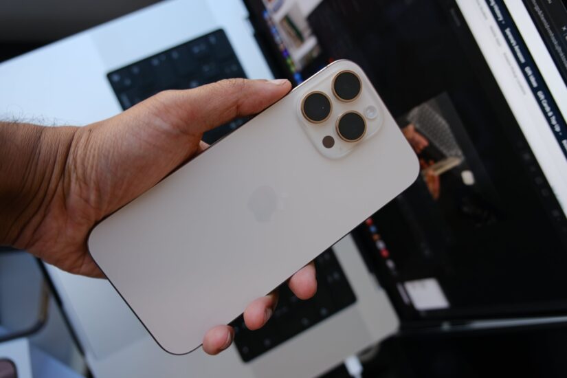
My iPhone 16 Pro Max was delivered four days ago, and I’ve spent around 96 hours with the phone. Not much has changed between the 15 Pro Max and the 16 Pro Max, but there have been many refinements. These are my initial impressions.
Physical Impressions
The interesting thing about this phone is that when I held it in my hands, it didn’t necessarily feel physically bigger than my 15 Pro Max, but the display feels larger. It’s only 0.2 inches bigger, but when I use my 16 Pro Max and then go back to the 15 Pro Max, it feels like I’m using a smaller phone. There’s a bit more text visible on the screen, and there’s slightly more available screen space. However, physically, the phone doesn’t feel bigger.
The bezels look comparatively smaller too, although, if you put a case on it, you won’t notice the difference. Remove the case and put it next to the 15 Pro Max, and you’ll see the difference. If you don’t have the 15 Pro Max to compare it with, you’ll notice the smaller bezels but won’t realise just how much smaller they are. The iPhone X marked the biggest leap in terms of creating a phone with identical and small bezels on all four sides, and after years of refinement, the 16 Pro Max has the smallest bezels yet. At times, they almost feel too small.
Where I notice a difference, and not in a positive way, is in the weight. The 16 Pro Max is about seven grams heavier than the 15 Pro Max, but I can definitely feel the difference. Seven grams isn’t a lot, but it feels significant. When the 15 Pro Max launched, I wrote about it being the nicest feeling iPhone yet, and I still believe that’s the case. This is due to the weight difference, not the size difference between the 15 and the 16 Pro Max. The weight distribution also seems to have an impact; the 16 Pro Max feels heavier in the middle of the phone, literally right over where the Apple logo is.
Desert Titanium
My favourite colour, since the move to titanium last year, is the natural titanium. The same holds true this year as well. I didn’t want to have the same colour two years in a row, and I didn’t want to get black or white as they’re the usual colours, so I ended up with Desert Titanium.
Desert Titanium looks like a mix between a pale gold and pink. The back of the phone has a sort of pinkish-salmon hue. It’s really hard to describe, as it looks different depending on the lighting. Pink/gold isn’t a colour I would usually choose, but this one does look great, though not as good as natural titanium.
The Ultramarine colour in the non-Pro iPhone 16 line-up is the best colour this year, I hope one day Apple give the Pro line-up some fun colours too.
The Cameras and Camera Control
I haven’t spent enough time with the cameras to say if they are a worthwhile upgrade, and it seems the camera is mostly unchanged from the 15 Pro Max, apart from the bump to 48 megapixels on the ultra-wide lens and the “faster” sensor on the main lens.
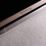
What is new is the camera control (button). The camera control is on the side of the phone, but not exactly where I thought it would be. If you pick up a “real” camera, the shutter button is exactly where you’d expect it to be ergonomically. But the camera control button on the iPhone isn’t—it’s positioned a bit further towards the centre of the phone. I haven’t actually tried the smaller 16 Pro, but from the pictures I’ve seen online, it looks the same on the smaller phone as well. So it’s not just a case of the button being in the wrong spot on the larger phone.
This isn’t to say Apple messed up or that “I’m holding it wrong,” but more that we need to get used to it. I think the reasoning behind placing the button here is to make it easier to use in both portrait and landscape orientations. Oddly, I can reach the camera control button single-handedly in portrait mode; my right thumb naturally lands on it. In landscape mode, I just need to adjust how I hold the phone. Turns out I was holding it wrong?
The camera control definitely takes some getting used to. I went on a photo walk yesterday and kept hitting the shutter button on the UI out of habit. After 15 or so years of iPhones having only one way to take a picture (aside from the volume button, of course), it takes time to adjust to this new control. Overall, I really like the new camera control, and I’m glad the company that was once determined to remove buttons is now giving us more (although Apple is not calling this a button, but it is what it is.)
I have a lot of thoughts on the camera control and will write more about it in the next few days.
Battery Life
It’s too early for me to comment on the battery life. However, it’s already much better than my 15 Pro Max, though my 15 Pro Max is at 93% battery health, while this one has a fresh battery with only one or two charge cycles.
One of the benefits of upgrading to a new iPhone every year is having a brand new battery. Apple claims that the 16 Pro Max has the best battery life of any iPhone. The 13 Pro Max was the king of battery life—so is the 16 Pro Max really the best? I’ll test it more and report back.
Closing Thoughts
I consider myself fortunate to be able to upgrade to a new iPhone every year. Each year, I keep hearing the same lines: “It’s the same phone” and “Nothing much has changed.” This year, there’s an additional comment I’ve been hearing: “Apple Intelligence isn’t even launching with the new iPhone.”
It’s true, but at this point, I don’t pay much attention to the first two statements. Upgrading to the 16 Pro Max from the 15 Pro Max was absolutely worth it for me – as a tech enthusiast it just brings me joy. People keep repeating “It’s the same phone” and “Nothing much has changed,” but if you compare an iPhone from a few years ago to the 16 Pro Max, how did we get here if nothing has changed? Things do change, they are just as not significant as some people want. The iPhone is a mature product, and all it requires from Apple is to keep refining it every year. It’s a product with a lot of goodwill, and Apple can’t afford to do something drastic that might ruin the reputation of this rectangular slab containing glass, silicon, and metal.
As for the point about Apple Intelligence not launching with the phone, that’s true as well. However, I see it as an extra feature I’ll receive during the lifespan of this 16 Pro Max. Yes, I could have gotten those features on the 15 Pro Max, but Apple Intelligence is not the reason I bought this phone. You shouldn’t buy a phone based on promises of future features either.


